"Are they just 'riding the trend'
or are they really about it?"
Interviewee quote
Research & Learn
Interviews
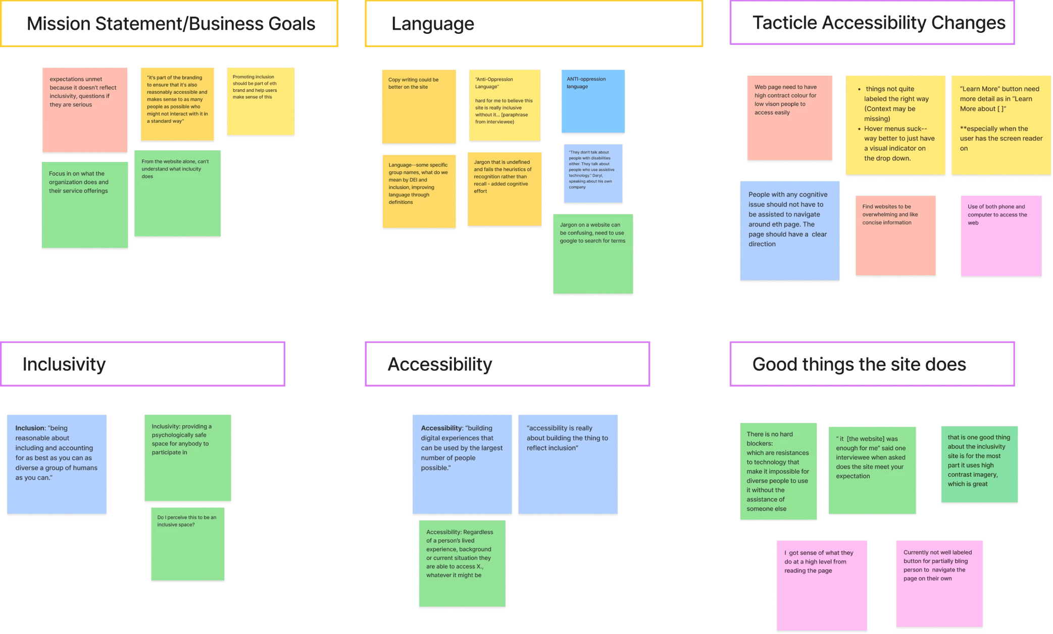
We commenced by understanding IncluCity's objectives and their user base. We conducted in-depth interviews with four clients, which led to the emergence of key issues such as: unclear website copy, a lack of inclusive design, and difficulties differentiating user types. Interestingly we discovered a deeper concern: despite trust in the organization, interviewees failed to have the same level of trust in the website, raising questions about its alignment with IncluCity's mission.
Affinity diagram of interviewee responses
Accessibility audit
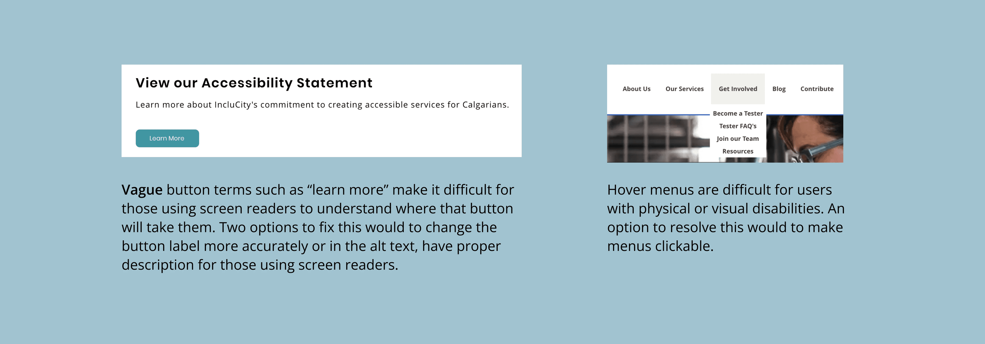
Concurrently, an accessibility audit revealed multiple website flaws, affirming user feedback.
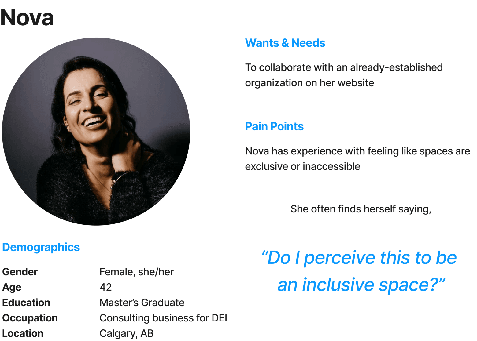
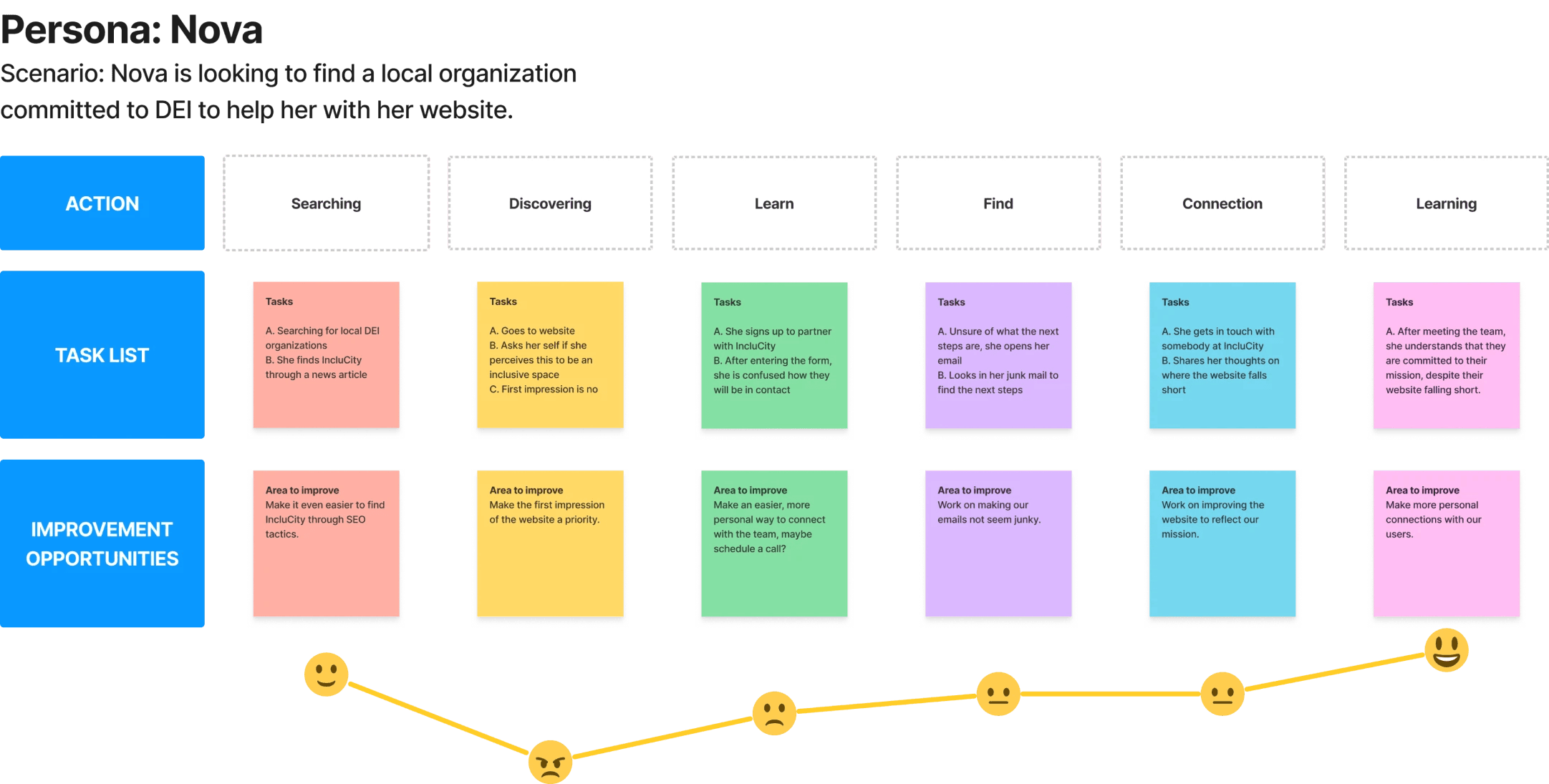
Who is IncluCity's user?
Nova's journey
To focus user needs, we synthesized our findings into a persona, Nova, a DEI consultant embodying a potential client. We crafted a detailed user journey map, by stepping into Nova's shoes to experience firsthand the challenges of seeking an organization aligned with DEI principles. This exercise illuminated a persistent issue that website struggled to instil trust and credibility upon initial interaction.
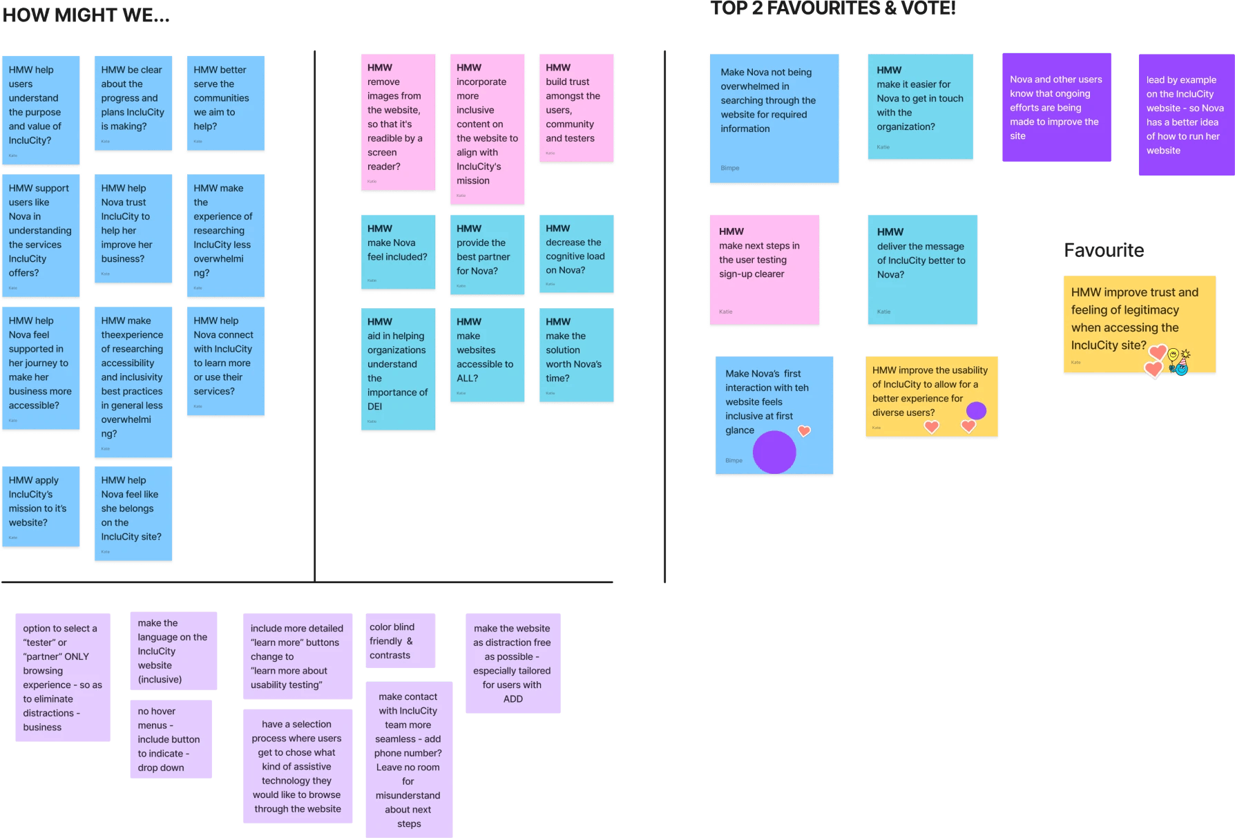
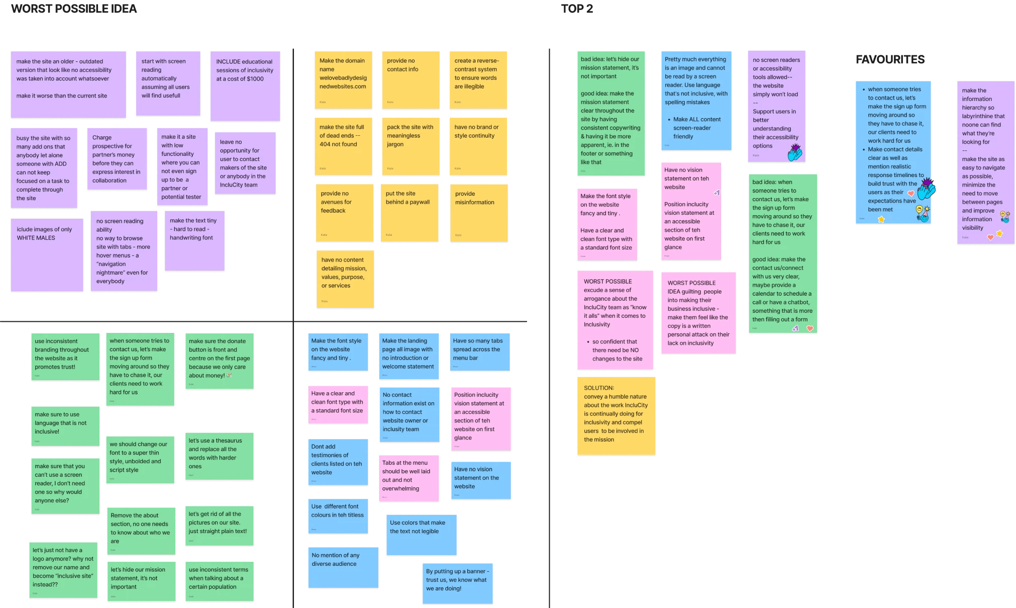
Let's ideate
Focusing in
By conducting collaborative sessions, including 'how might we' and worst-possible-ideas workshops, we were able to narrow our focus. We zeroed in on a pivotal question: 'How might we enhance trust and legitimacy on the IncluCity website?' This led us to prioritize refining information architecture and simplifying contact options to strengthen user confidence.
Designing a Solution
Low & Medium Fidelity Wireframes
We embarked on an iterative design process, starting with low-fidelity & medium fidelity wireframes leading to a redesigned landing page. Our emphasis was on decluttering and providing clear user pathways based on the roles of clients, volunteers, and testers.
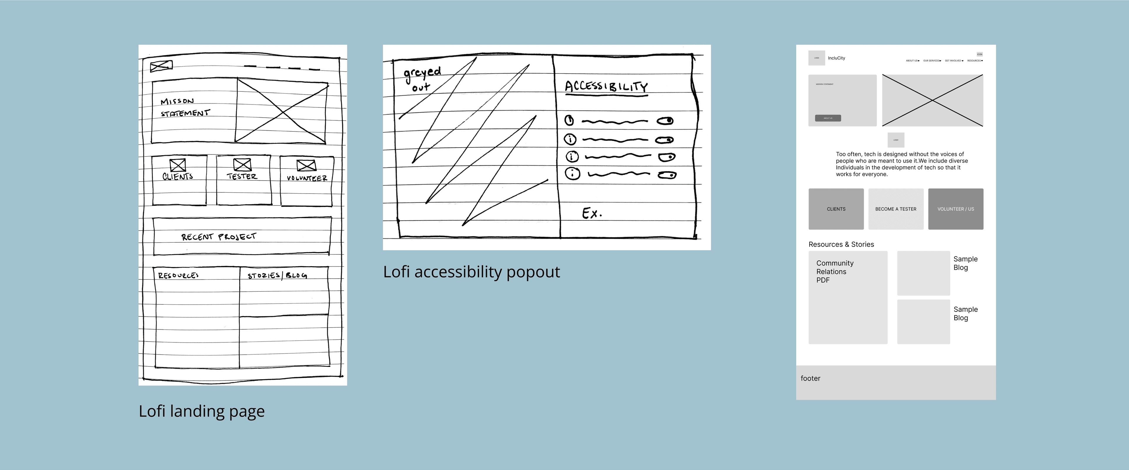
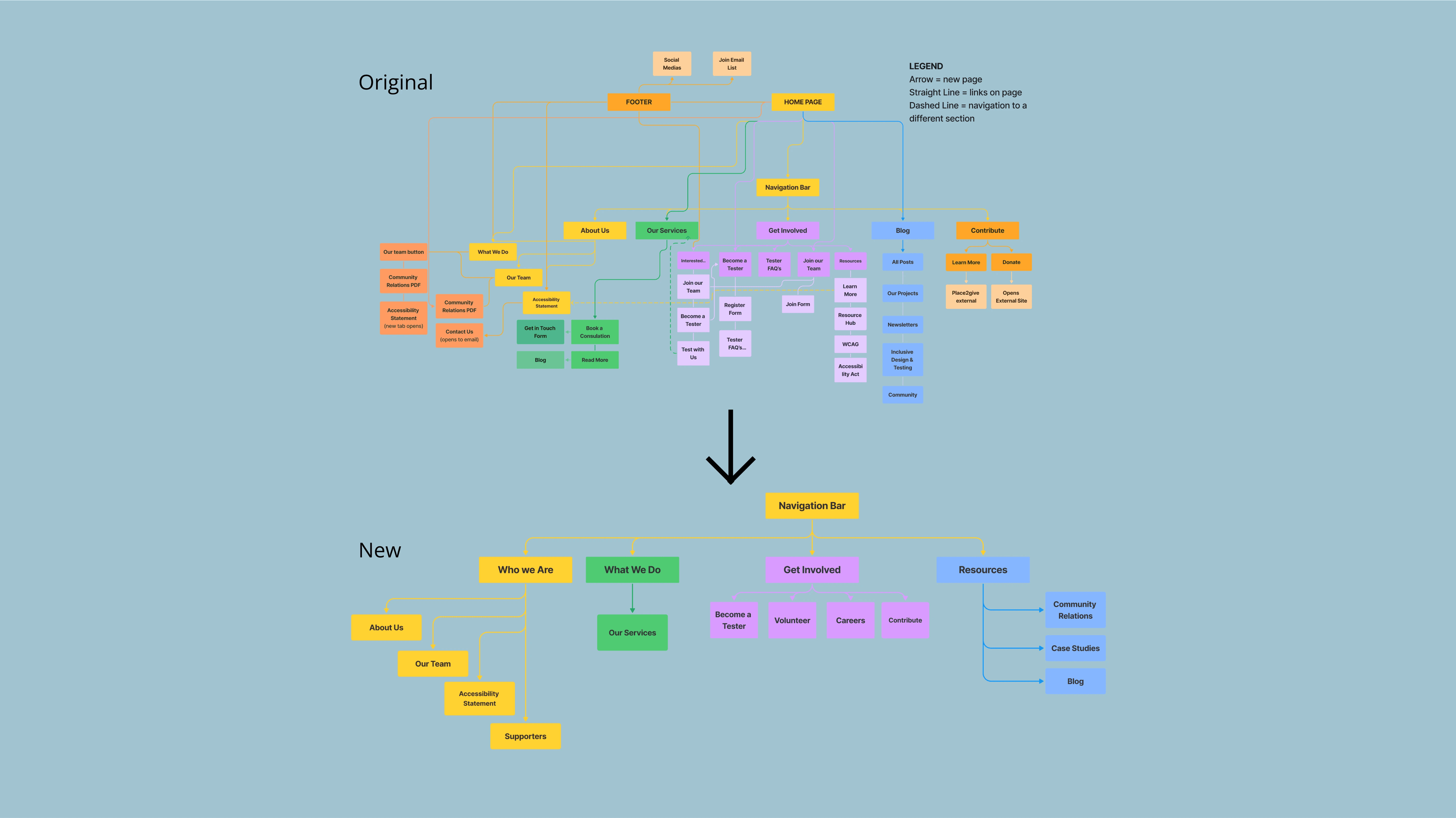
We didn't forget about information architecture
During the design phase, our focus revolved around simplifying the website's architecture. We initiated by mapping out the existing infrastructure, identifying its user experience complexities. With these insights, we worked on a comprehensive redesign, striving to transform the architecture into a more intuitive and user-friendly framework.
High-Fidelity
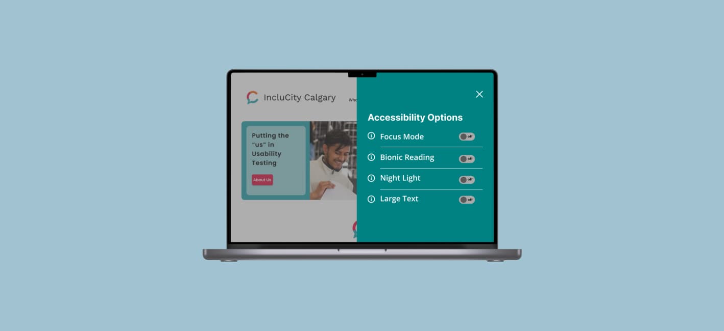
As we progressed to high-fidelity wireframes, we concentrated on approachability and simplicity, reorganizing the menu structure to streamline information retrieval. Moreover, we explored the integration of accessibility filters directly into the website's code, envisioning options like bionic reading, night light, larger text, and focus mode. Though time constraints precluded thorough usability testing, these prototypes embodied our collective vision for an inclusive and accessible digital interface.
Reflections
Every journey will have bumps...
Despite time limitations and constraints in meeting frequency, the project provided invaluable learnings. Collaboration with a real client and product managers was enlightening, highlighting the need for more individual contemplation to mitigate biases and encourage diverse perspectives.
The redesign journey underscored the intricate interplay between inclusivity, accessibility, and trust in web design. Our team’s developed prototypes reflect an earnest endeavour to address user concerns and align the digital experience with IncluCity's mission.